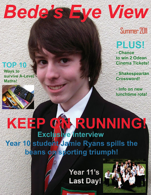
2/The Lead: The introduction to a text, usually bold or in capitals to catch the eye
3/Body Copy: the main article of text (usually grammatically correct) (Usually in Columns)
4/Serif Font: Font which has small bars (serifs) at the end of each letter (Like This Text)
5/Sans Serif Font: Font which does not have serifs present (Like This Text)
6/Drop Capitals: A significantly larger letter at the start of a text (Like This)
7/Cross Head: small sub-heading to divide two bodies of text (Usually a quote from the text)
8/White Space: Any blank parts of the page
9/Mode Of Address: How the magazine talks to the audience
10/Sell Lines: Like a motto for the magazine (Kerrang- Life Is Loud)
11/Banners: Text made to stand out due to the contrasting background colour (Like This)
12/House Style: the overall, trademark like layout of the magazine, almost like the identity of the mag
13/Boarders: The gaps at the ends of pages
14;Gutters: Where the two pages meet in the middle and there is no text
15/Leading: The gaps between the lines of text in the mag
16/Kerning: The space between letters in the mag
17/Strapline: A secondary headline just below the main headline
18/Bylines: Credits to the people who produced each article including photo credits and data sources
19/Anchorage: When text and images go hand in hand and are relevant to eachother, supporting eachother


No comments:
Post a Comment